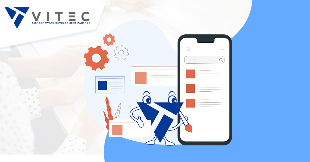
Design Is How IT Works - Transforming a motivational vision into an inspirational UI/UX

"Design is not just what it looks like and feels like. Design is how it works." We think you can take Steve Jobs' word when it comes to designing user experiences and interfaces. And one customer survey after another stand testament to his statement.
3 out of 4 customers make their judgment about the credibility of your website purely on its aesthetics. So, it should not come as a surprise when we tell you that 70% of online businesses fail due to bad usability. What do you expect when 75% of the visitors coming to your website leave unimpressed?
At Vitec GmbH, our experience compelled us to curate a user journey culminating in your vision that aligns with what your customers were looking for using sophisticated design elements. But we needed to travel that road first ourselves. So, we transformed the UI & UX of our business' website to get the customer's POV.
And now that we are at the finish line, we want to reveal our first-person experience. Shall we?
A Good Point to Start Our Story – The Vision
We feel obliged to indicate the primary difference between UI and UX because we have seen some people use them interchangeably. In the simplest words, UX or user experience means how things on your platform work. On the other hand, UI or user interface refers to how things look.
So, when we began our journey to develop our UI & UX, we started with our vision as a guiding light.
"To become a 360° Software Development Partner for our clients."
We treated this the ball to all the spokes that would go into our UI & UX development. It also helped us to ask the right questions and then venture out to explore their answers. Here are the questions we asked ourselves (and will ask you) when developing your user experience and interface.
1. What Pages Do We Need On The Website?
We created a good old list. Our experience and industry research helped us create multiple pages for our website. We understood what our customers were looking for, and we edited down the number of pages as we went forward. The pages should not be too many to overwhelm our customers, but not too few that it drove them away without finding what they came for.
2. What Are the Sections We Need On Each Page?
Every section on each of the pages is strategically placed. They had to fulfill three criteria – contain optimized content, enhance website experience, in line with our vision.They must fulfill the functional need and help the visitor better understand Vitec's future potential as a 360° Software Development Partner.
3. How Do These Pages Contribute To Our 360° Vision?
Our cross-functional teams had to work together in harmony. There had to be a resonance between content teams that would create engaging content with accurate information, the design teams that would work in pleasant design effects, and the top management, ensuring that even the smallest element spoke of the vision.
4. What Do We Want Our Customers to Take Away?
We want the visitors to our website to smile while surfing around. It should be intuitive, seamless, and informative.
When we designed the Vitec GmbH website, the focus was on the customer. At its root, the brainstorming process was how to make the final product be at the perfect meeting point of our business vision and our customers' needs. At the same time, the website had to check all the boxes of agility, functionality, and beauty. We take pride in the fact that today our website is a good starting point for ideas for our customers on unified design elements, intuitive navigation, and valuable content.
Getting into the Thick of IT – The Design Elements
We are now moving on to the specifics by putting each UI and UX element transformation journey under the magnifying glass. You will see that every decision derives from the singular vision. It is interpreted in different forms throughout the website through various UI and UX elements. You will also observe how many decisions went into creating the unique picture that is the Vitec GmbH website. Let's begin!
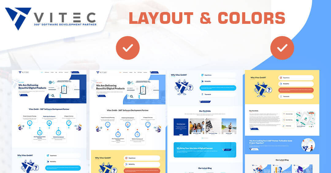
1. Coloring And Fonts Unification
We had a solid pallet of colors on the website, to begin with. The website looked "fine" with its blue and dark blue duet. The new website had to be better than satisfactory. It demonstrated our evolution from a software service provider to a 360° Software Development Partner. We did not want our visitors to envision our services in an isolated cubicle but as part of a larger ecosystem. The addition of a contrasting color accomplished accentuating the different UI elements.
The color switch may seem a small step, but it sets the tone for the entire user experience. The color differences guide the customers to different service offerings. They also help present the service ecosystem instead of offering a set of random services.
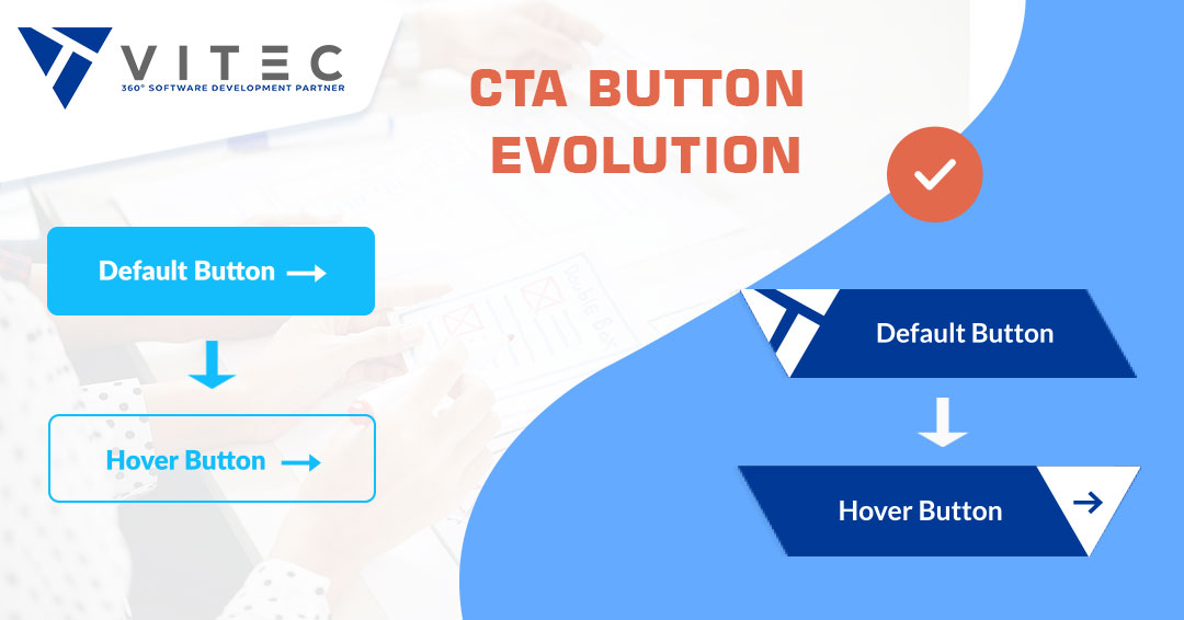
1. CTA Button Evolution
Call-To-Action is one of the most underrated design elements on the website. It is almost an afterthought. But, at Vitec GmbH, we consider the CTA button is one of the primary elements impacting sales.
Our goal with the CTA button design was to make it more visible, welcoming, and attention-grabbing. We achieved it with our unique design and color choice. We switched to a richer color to intensify the contrasting effect. We moved from banal text to more clickable, snappy CTA text as well. But one clever change that pushed our CTA button to the next level by customizing the cursor at it hovers over it. You can see, the shape of the cursor is not random, but takes our company logo to increase branding. The shape of the whole CTA button itself matches the company logo, so when someone moves their cursor over it, this element can move seamlessly. It sounds like a small thing, but it's another step that connects the entire website to our branding, naturally makes the CTA more noticeable, and the client more prone to take action.
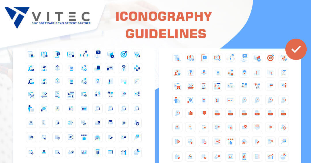
2. Custom Iconography
The next UI/UX element on our 360° transformation agenda was our service icons. While the original designs of our service icons were solid to start with, they did not merge to form one picture.
The new icons solve this problem by taking the color & design inspiration from the company logo. In fact, every service icon has the company logo worked into its design. Such a granular design change helps our clients instantly pick up on the ecosystem vibe. They are not working with a software vendor but a partner.
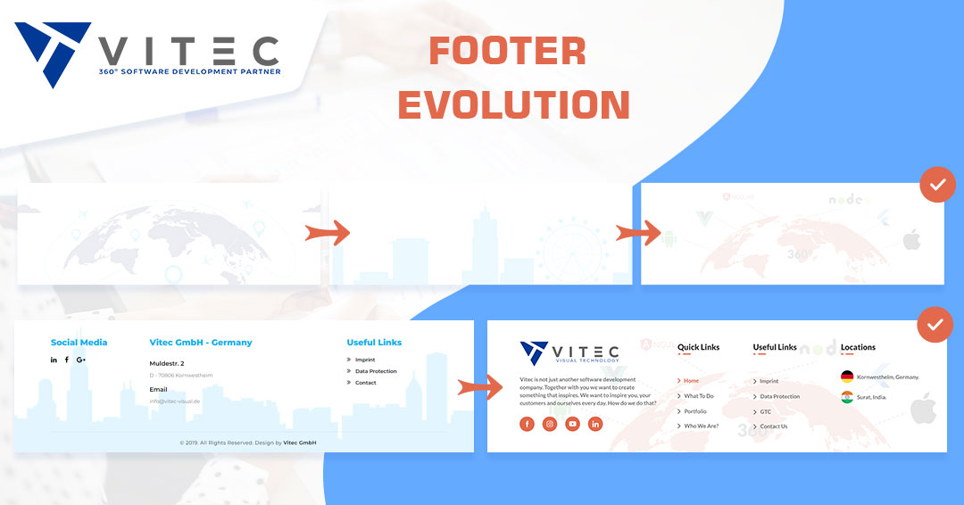
3. Footer Evolution
Every little detail on a website page count and should represent the brand you are trying to build. Vitec's evolution to a 360° Software Development Partner is reflected even in this segment of the website. The inclusion of a globe with technology indicates the global reach of our turnkey services and referring to the 360° we provide. The "Quick Links" also send out the unifying theme of the new Vitec website.
Let’s Pace Ourselves
Then there’s the price calculator, and the incredible changes in footer design, and then there is the animation, and so much more. We can’t wait to tell you! But we have to.
Vitec GmbH website evolution happened over many phases. Stuffing everything into one blog will not do justice to your curiosity or our effort. So, let’s pace ourself and stop here today. Let’s discuss the rest of the design elements – small and big design – in the next blog.


Aleksandar
Aleksandar is a passionate digital marketeer with 6+ years experience in various industries. He finds the data & numbers are the way to market things, but also that words are the bridge between just a numbers and brand value, purpose and strategy brought to a user. Using the 5 'W' methodology in creating the content, he is adding 'a plus to a minus', creating simple, but informative blogs & case studies about latest trends in tech & digital indsutry.